

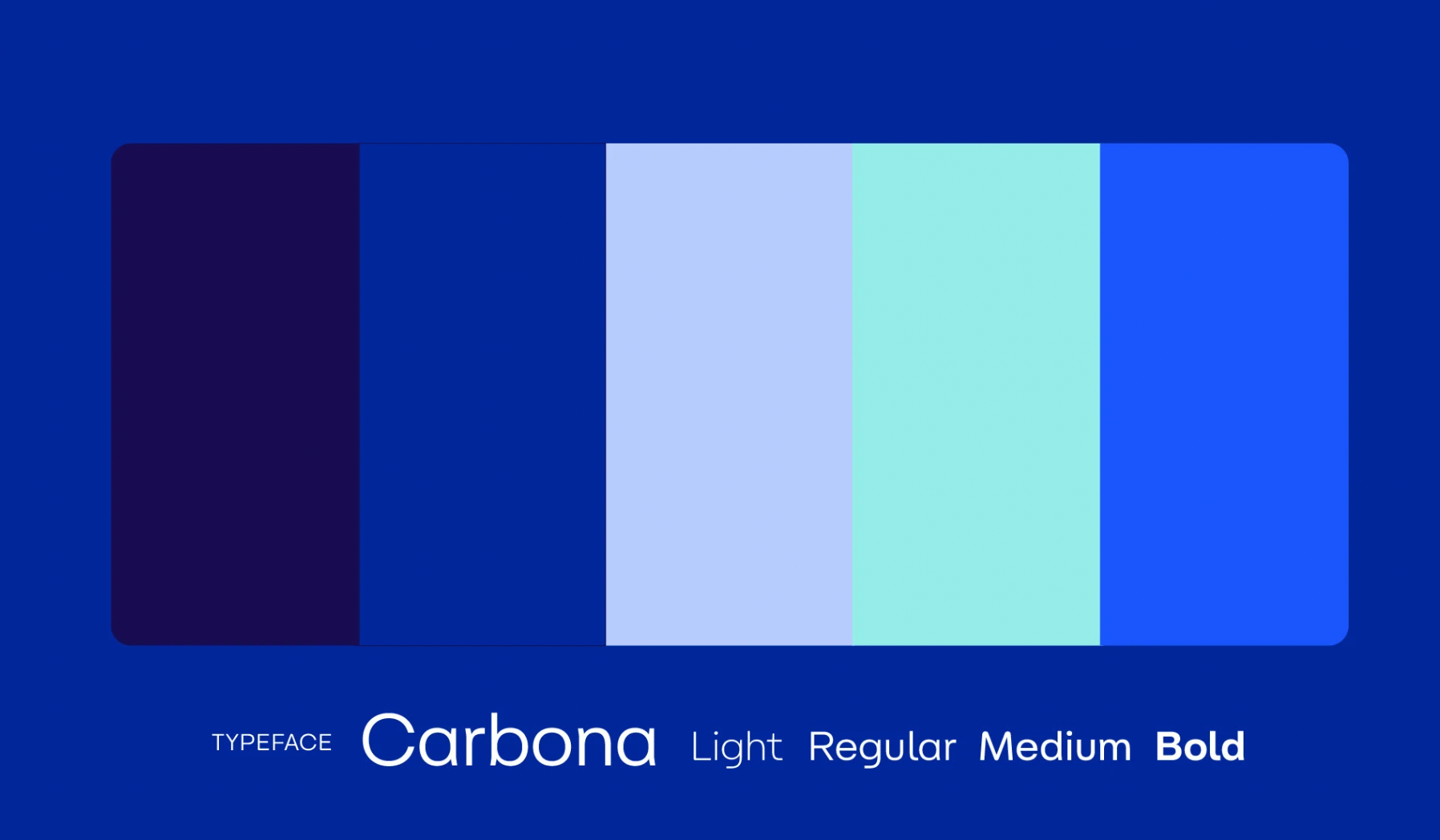


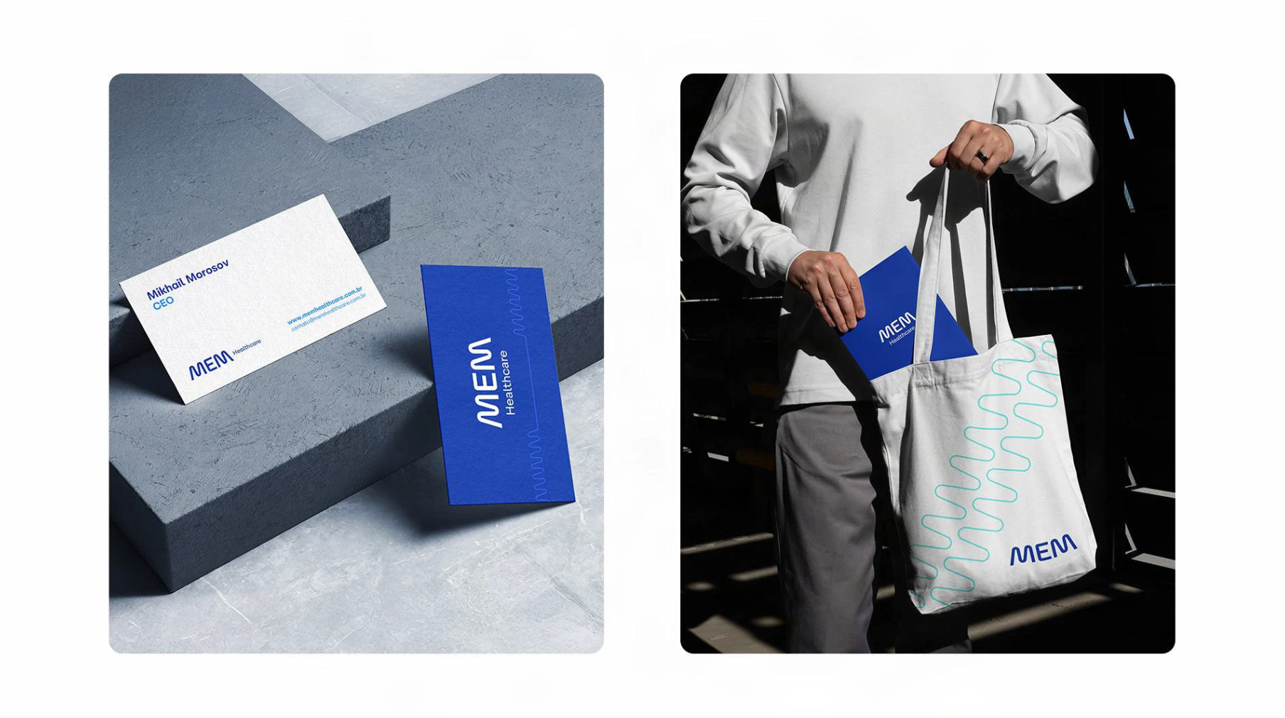


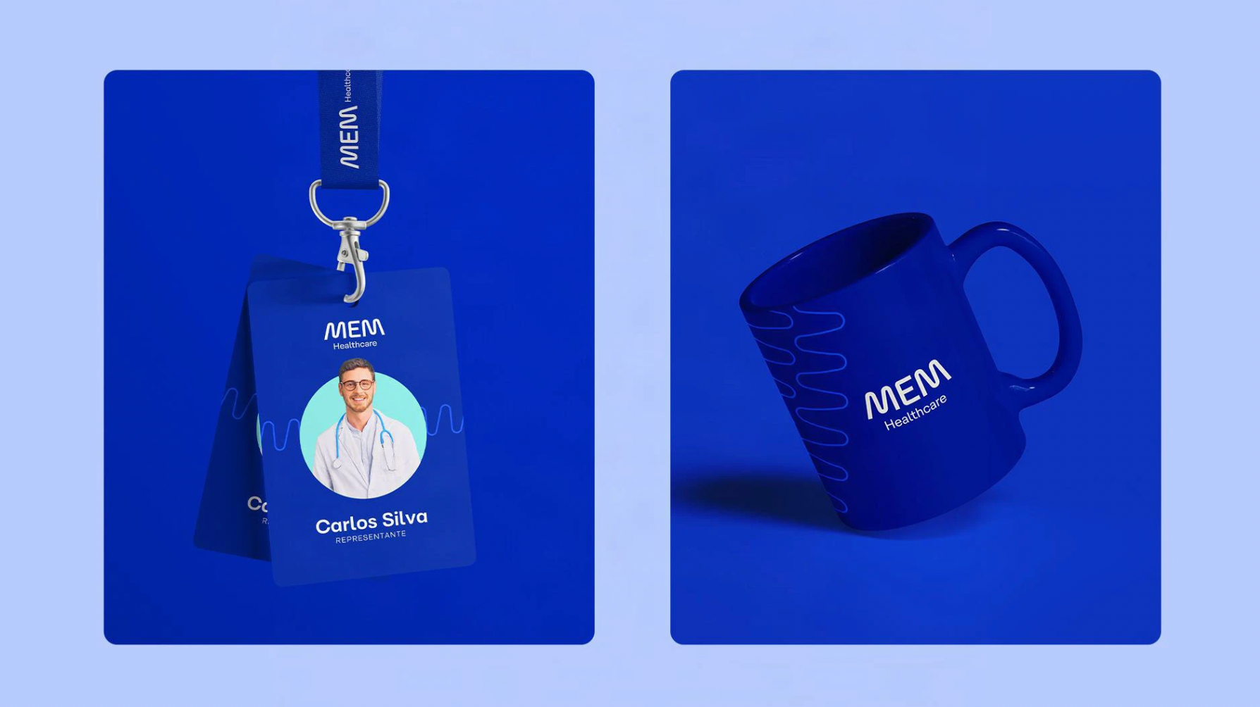


Each letter in the logotype was crafted to reflect the brand’s strategic foundation, including its archetypes, manifesto, and tone of voice. The slanted, mirrored M symbolises movement, innovation, and the brand’s Brazilian roots, while the E represents connection across countries and partnerships. The structure of the M also signifies collaboration between MEM and its partner brands. This M extends into the visual system, forming supporting graphics that subtly reference vital signs—reinforcing the brand’s link to the healthcare sector.